Why text gets jittery when scaled on Android
Around 2 years ago, Wear OS team had a problem with their new Picker composable, the text looked jittery as the picker was scrolling.
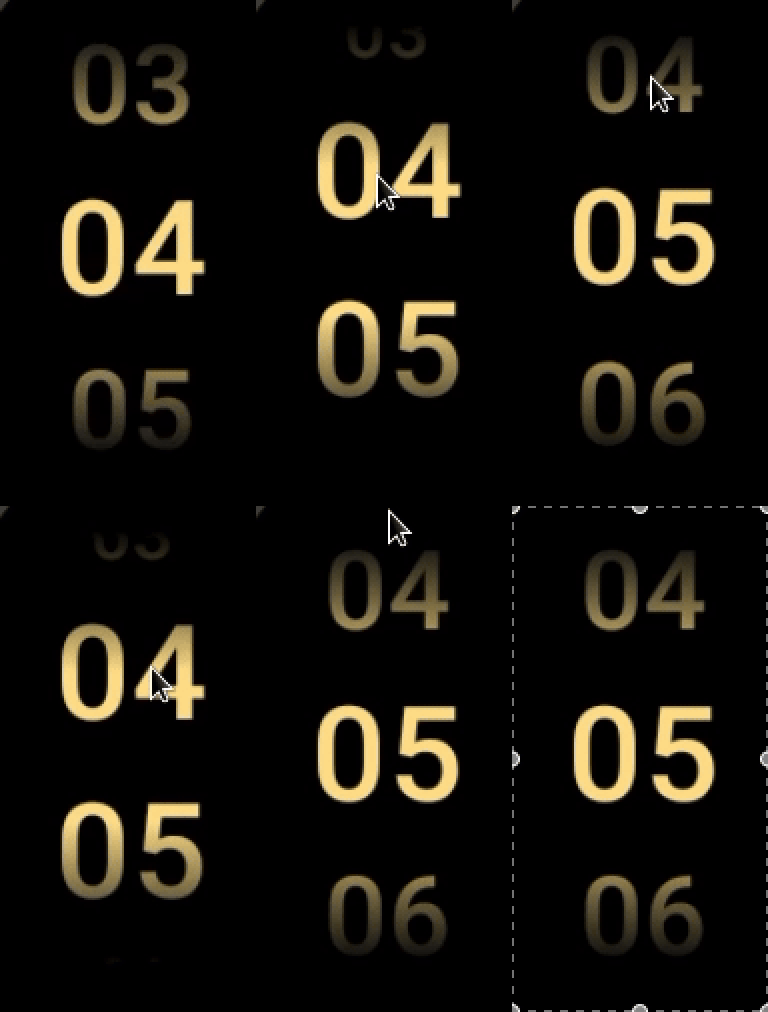
If you cannot figure out what's wrong with the above recording, focus on either top or bottom row, then take a closer look at number zero.
Wear OS team weren’t the first ones to run into this issue on an Android based platform, nor would they be the last. My initial investigation into this problem led me down a path of graphics, text, and Android’s history of these two domains.
Eventually my investigation turned into an internal research document that I’ve been referencing regularly for the past 2 years. At the time, this work also paved the way for one dedicated API (TextMotion) and sped up the development of another (CompositingStrategy).
This post is just the publication of that document without much editorial input.
- I had to remove some internal links.
- I purposefully chose to get rid of design document elements. That part is not interesting.
Acknowledgements
Usually the acknowledgements section comes at the end of articles or papers. This has never made sense to me. Especially, right now. Most of my research was practice as you will see in this post but my curiosity was lit by this document, written by Behdad Esfahbod, the author of HarfBuzz.
If you have time and are hungry for more in-depth exploration of text shaping and rendering, albeit from 2012’s perspective, please read the whole thing. The fact that it is public is what also encouraged me to make my own work public.
I would also like to thank Siyamed Sinir, Seigo Nonaka, Ben Wagner, and John Reck for their invaluable help in this research.
Now, let’s get into it.
Jittery Text Scale Animations
Problem: Compose Text looks jittery when a graphicsLayer scale animation is applied on it.
This problem is not isolated to Compose though. Same problem was first reported for TextView in [an internal issue link]. [A teammate] first proposed to use LINEAR_TEXT_FLAG, maybe enabling it by default on Compose. Later, Wear OS picker composable which scales the text when it’s scrolled vertically brought the issue forward. The problem looked to be reproducible upon closer inspection in Compose UI on a phone since Compose for Wear OS does not have a separate text layout/render engine.
Please take a look at the following videos to see the difference between jittery and smooth animation.
| Jittery | Fixed |
|---|---|
Background
Text scale animations are susceptible to jittery font issues if the right flags and configurations are not applied on the text paint.
There are many properties regarding fonts, graphics layering, text positioning, anti-aliasing, etc. that affect the final rendered text on the screen. This issue, like many rendering issues in Text, stems from how rasterization is done and scaled.
Glyphs get placed at whole or fractional pixel positions according to font metrics and the mentioned paint features. Scaling gets applied on an already finalized text layout, which brings us to the root issue: the linearity of text.
I’ll just quote Behdad because he is one of the best people who can explain linearity vs non-linearity.
When it comes to layout, there are two opposite directions you can go: linear, and non-linear. Glyph positions produced by a linear layout function can be transformed by an affine (or even projective, if you are careful) transformation, and they would result in exactly what would have had resulted if the font scale matrix was transformed by such transformation before layout. i.e. linearly laying out a paragraph at 12pt to a width of 4in will result in the exact same look and line breaks that results from setting it at 24pt to a width of 8in. That’s a very nice property, because it means that you can zoom, rotate, translate, shear, even project the layout results freely.
Non-linear layout would be different. For example, you may decide (for many legitimate reasons), that at 10px size, the glyph for letter ‘i’ should take 2 pixels of space (one column of black stem, one column of white space after). But the same glyph, at size 20px may take only 3 pixels (one full black stem in the middle column, and two very light gray columns on the sides). That’s clearly non-linear, because although the font size was increased 100%, the glyph width only increased 50%. Note that this is not a matter of local error. If you consider a string of i’s (“iiiiiiiiiiiiiiiiiiiiiiiiiiiiiiiiiiiiiiiiiii”), the whole string is now only 50% wider than the one “half the size”. Line breaks will be calculated differently, page breaks will be calculated differently, and the document may end up consuming a different number of pages. In short, with non-linear layout all bets are off.
Basically, text rendering is an analog process that happens on a theoretical canvas. The majority of font metrics are subject to be calculated at fractional values when the canvas is arbitrarily scaled. Hence, Skia and Android Paint classes provide flags for subpixel positioning, line metrics, baseline snapping(Android excluded, only Skia) and font hinting that decide whether to use whole or rational numbers to place glyphs on this theoretical canvas.
Some of these properties violate the linearity of text, which affects how humans perceive scaling animation.
Scale vs Text Size
Scaling text on screen can be achieved in two different ways in Jetpack Compose. The first one is using graphicsLayer, scaleX, and scaleY parameters.
Most developers will probably go for this solution since animating a float comes easy and intuitive, and also googling for scaling animations in Jetpack Compose usually suggests this method whether it is for text or any layout node.
The second method is scaling the fontSize parameter by converting an animating float value into sp. This might seem unintuitive to developers, not to mention it is more risky to mess with fractional font sizes, e.g., Lollipop onwards until Pie had fractional font sizes disabled.
Flags and Hinting
LINEAR_TEXT_FLAG, SUBPIXEL_TEXT_FLAG, and setHinting in Paint class directly affect how glyphs are shaped, placed, and positioned on a line.
Their effect becomes more negligible as DPI increases. However, text animations using either fontSize or graphicsLayer scaling make it easier to notice the difference even in high DPI screens due to the human factor.
Below, all static images are screenshots from an ldpi (3.3” 240x420) device running on Android API 33(T).
Hinting
From Wikipedia:
Font hinting (also known as instructing) is the use of mathematical instructions to adjust the display of an outline font so that it lines up with a rasterized grid. At low screen resolutions, hinting is critical for producing clear, legible text.
Font Hinting might remind you of 9-patch drawables. They are special bitmaps that define an image in 9 automatically scalable parts so that resizing the image won’t ruin the corners and edges. Similarly, font hinting describes how to scale a glyph to a non-predefined target size e.g. 16.7.
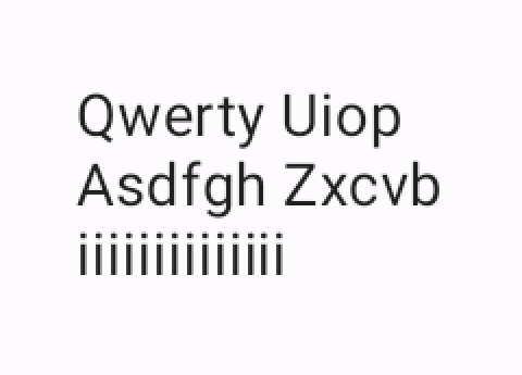
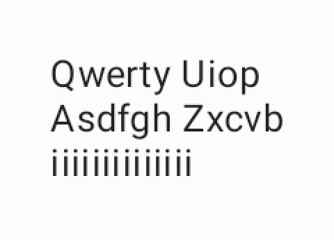
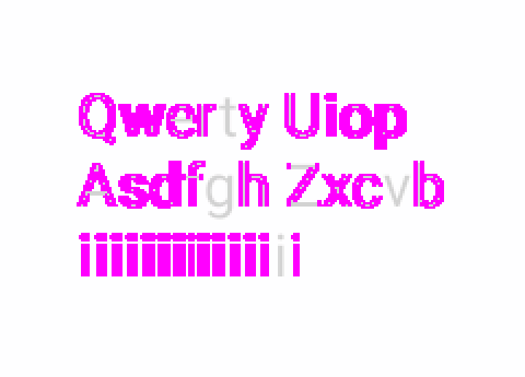
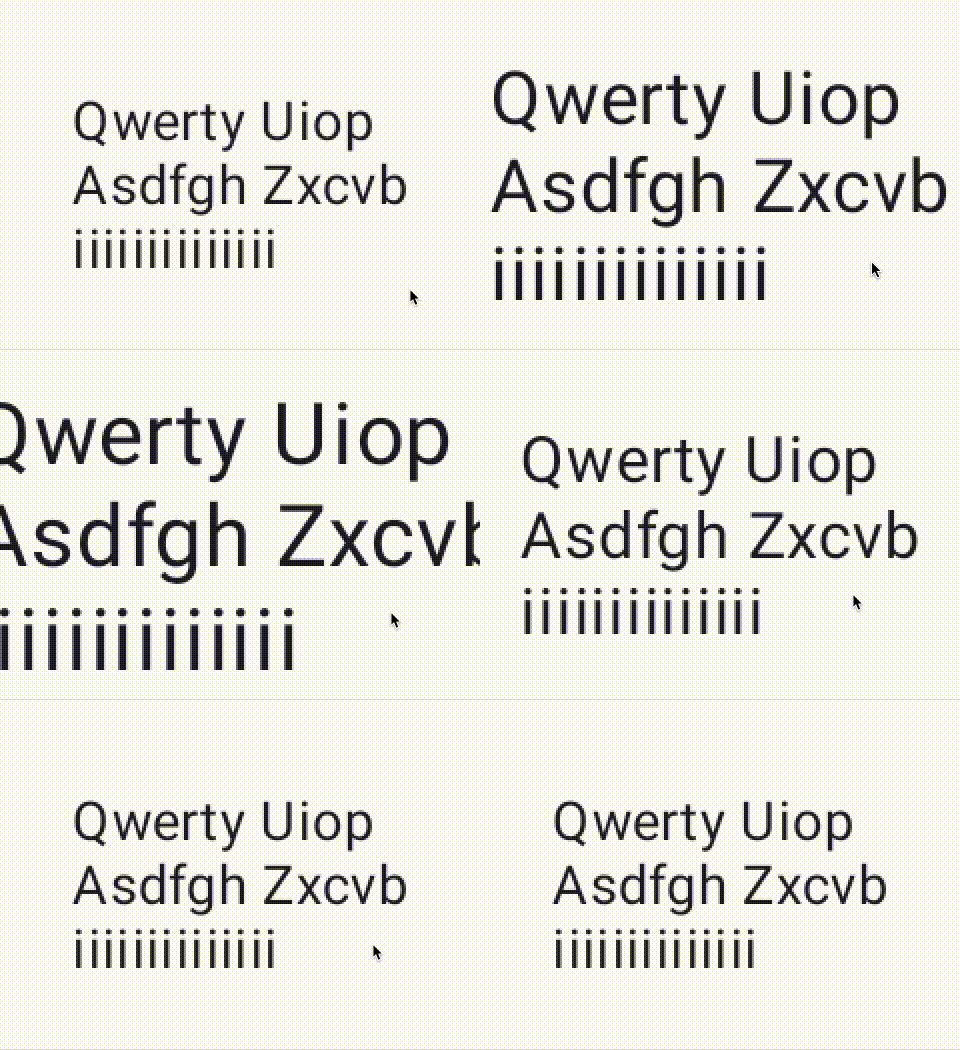
Hinting is one of many features that instruct text shaping engines to put glyphs onto a pixel and not use subpixel values while reporting final text layout. This behavior violates the linearity of text, meaning that scaling the text while hinting is enabled probably results in dancing glyphs on the screen.
| Disabled | Enabled | Diff |
|---|---|---|
 |
 |
 |
 |
 |
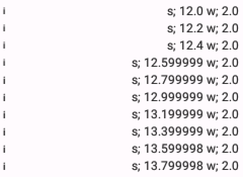
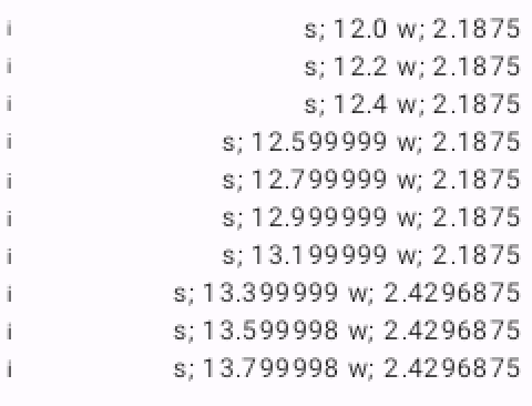
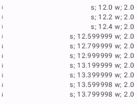
API 23 At this API level hinting is always enabled for some reason. Setting it through AndroidTextPaint does not seem to have an effect. I believe this is due to the fact that `LINEAR_TEXT` has been disabled after Lollipop(21) and was re-enabled with Pie(28). |
 |
 |
API 33
When hinting is enabled, the advance width of characters are hammered to pixels. No subpixel values are allowed. |
 |
 |
API 33 - graphicsLayer scaling
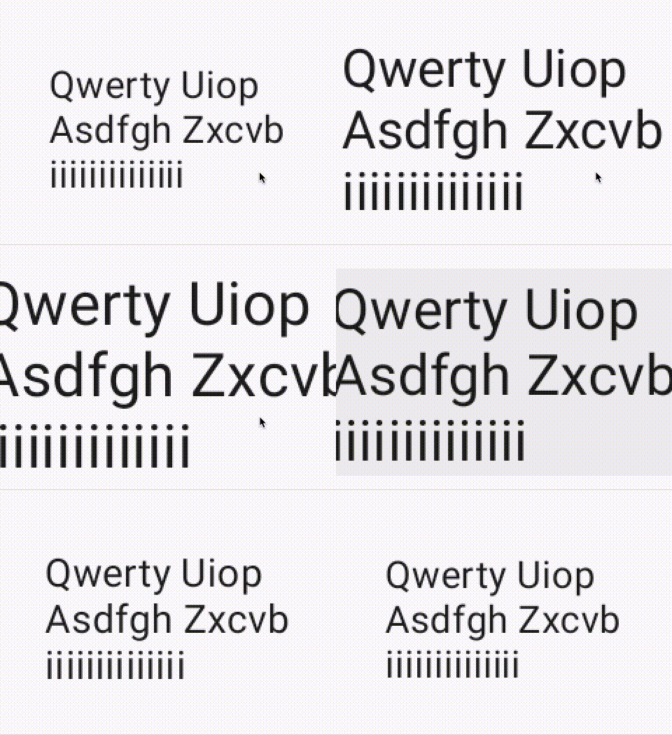
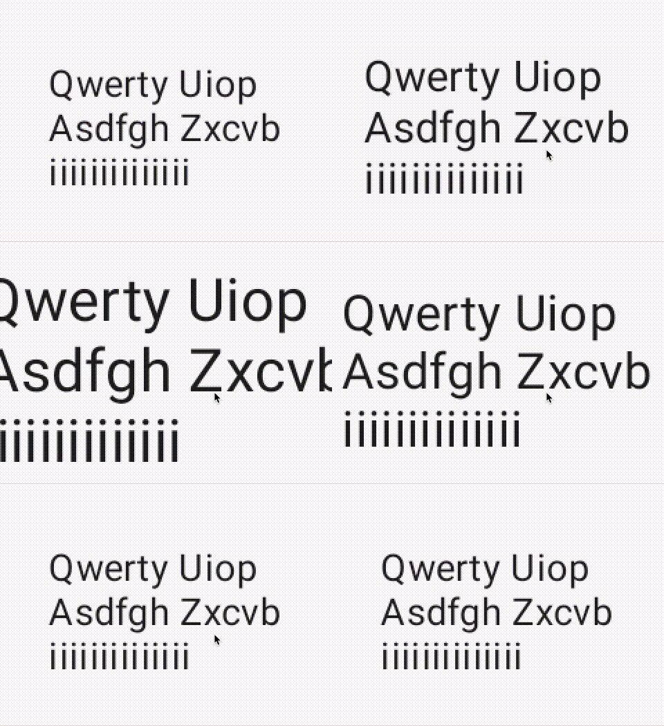
Only toggling hinting does not provide obvious benefits. In both cases we still see the animation suffering from jittery text. This animation is achieved via using graphicsLayer modifier and scaleX scaleY attributes. |
 |
 |
API 33 - fontSize scaling
The other method of animating the text is scaling the font size itself. This time hinting starts to show its face. Disabling hinting produces a better looking animation, albeit not perfect. This indicates that hinting is a non-linear property. |
LINEAR_TEXT_FLAG
From its documentation;
Paint flag that enables smooth linear scaling of text.
Enabling this flag does not actually scale text, but rather adjusts text draw operations to deal gracefully with smooth adjustment of scale. When this flag is enabled, font hinting is disabled to prevent shape deformation between scale factors, and glyph caching is disabled due to the large number of glyph images that will be generated.
SUBPIXEL_TEXT_FLAGshould be used in conjunction with this flag to prevent glyph positions from snapping to whole pixel values as scale factor is adjusted.
Although this description might require a few readings, it’s actually a super concise and accurate way of explaining what LINEAR_TEXT_FLAG enables which is introducing linearity to text rendering. Then the question becomes what does linearity mean in the context of text. I’m again going to quote from Behdad
When it comes to layout, there are two opposite directions you can go: linear, and non-linear. Glyph positions produced by a linear layout function can be transformed by an affine transformation, and they would result in exactly what would have had resulted if the font scale matrix was transformed by such transformation before layout. i.e. linearly laying out a paragraph at 12pt to a width of 4in will result in the exact same look and line breaks that results from setting it at 24pt to a width of 8in. That’s a very nice property, because it means that you can zoom, rotate, translate, shear, even project the layout results freely.
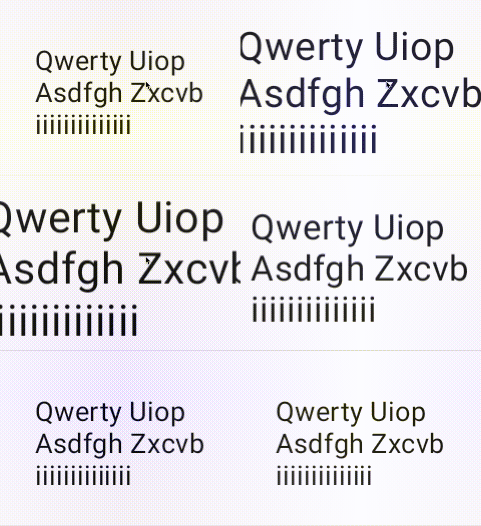
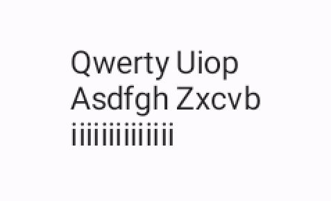
Linearity guarantees a constant text layout in the face of matrix transformations. Another thing we need to know is that metrics hinting introduces non-linearity to text layout. Therefore we understand why font hinting is disabled when LINEAR_TEXT_FLAG is activated. Let’s look at the following table that shows the difference between linear text and font hinting at different font sizes;
| API 33 | LINEAR_TEXT_FLAG | Hinting |
|---|---|---|
| 30.sp |  |
 |
| 36.sp | 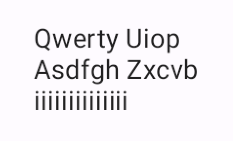 |
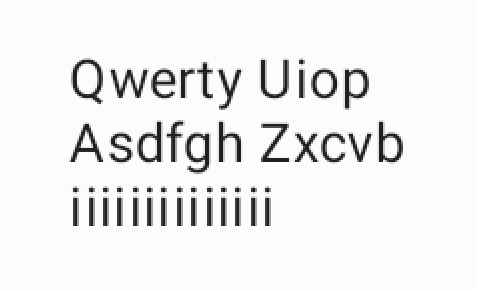 |
We can now see that scaling linear text does not change the position of glyphs in text with respect to font size. Take a closer look at the final i on the last line and Z on the second line. Their relative position remains the same. On the contrary, font hinting messes with this dynamic. i and Z clearly do not maintain their relative position which would affect line breaks.
Lastly, LINEAR_TEXT_FLAG is passed down to Skia by using setLinearMetrics. This flag enables outline fonts to scale their advance widths (total glyph width) to subpixel values according to Skia docs.
In the end, LINEAR_TEXT_FLAG makes it possible to animate font size smoothly thanks to using subpixel advance widths while calculating glyphs sizes. However, it has little to no effect while animating the scale of the drawing area after Text Layout is completed. This is very much unexpected from what I’ve been told and read in the documentation.
SUBPIXEL_TEXT_FLAG
Once again, let’s start with the documentation;
Paint flag that enables subpixel positioning of text.
Enabling this flag causes glyph advances to be computed with subpixel accuracy.
This can be used with
LINEAR_TEXT_FLAGto prevent text from jittering during smooth scale transitions.
This flag could be one of the most confusing configuration options. The confusion starts with its name.
First, subpixel sometimes used to mean something completely unrelated in text context; subpixel text smoothing/antialiasing. It is a different concept that does edge smoothing using the position of R/G/B channels on LCD screens. It’s actually supported through a flag in SkPaint class but the flag is hidden from the public API in Android.
Second, subpixel text positioning increases the spatial resolution by rasterizing glyphs for multiple subpositions. This helps antialiasing to correctly sample at different scales. Most importantly, SUBPIXEL_TEXT_FLAG gets rid of the horizontal wobbling while doing scaling animations. Unfortunately, it cannot get rid of vertical wobbling because that depends on baseline snapping which is not exposed through Android platform APIs.
| API 33 | Subpixel Off | Subpixel On |
|---|---|---|
| 36.sp | 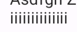 |
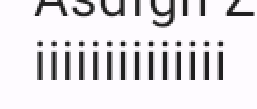 |
Also, subpixel positioning not only changes where glyphs are positioned, but also affects how they are anti-aliased. The screenshot on the left has the same i glyph positioned variously on the same line. The important part is that all is look the same. However, is are rendered differently from each other on the right screenshot when subpixel positioning is turned on.
Another point of discussion comes from Behdad’s High-DPI Subpixel Text Positioning document;
Note that when most people talk about subpixel text positioning, what they really mean is subpixel text positioning and no metrics hinting.
Subpixel text positioning defeats the purpose of metrics hinting because it enables text positioning at different scales to operate on subpixel values while hinting helps to render fonts at integer/pixel boundaries in the same conditions. Enabling both simultaneously does not make much sense.
DPI’s effect on Subpixels
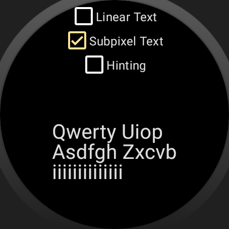
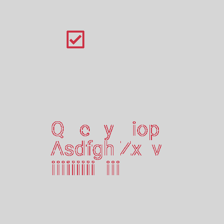
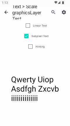
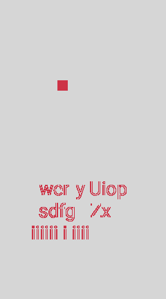
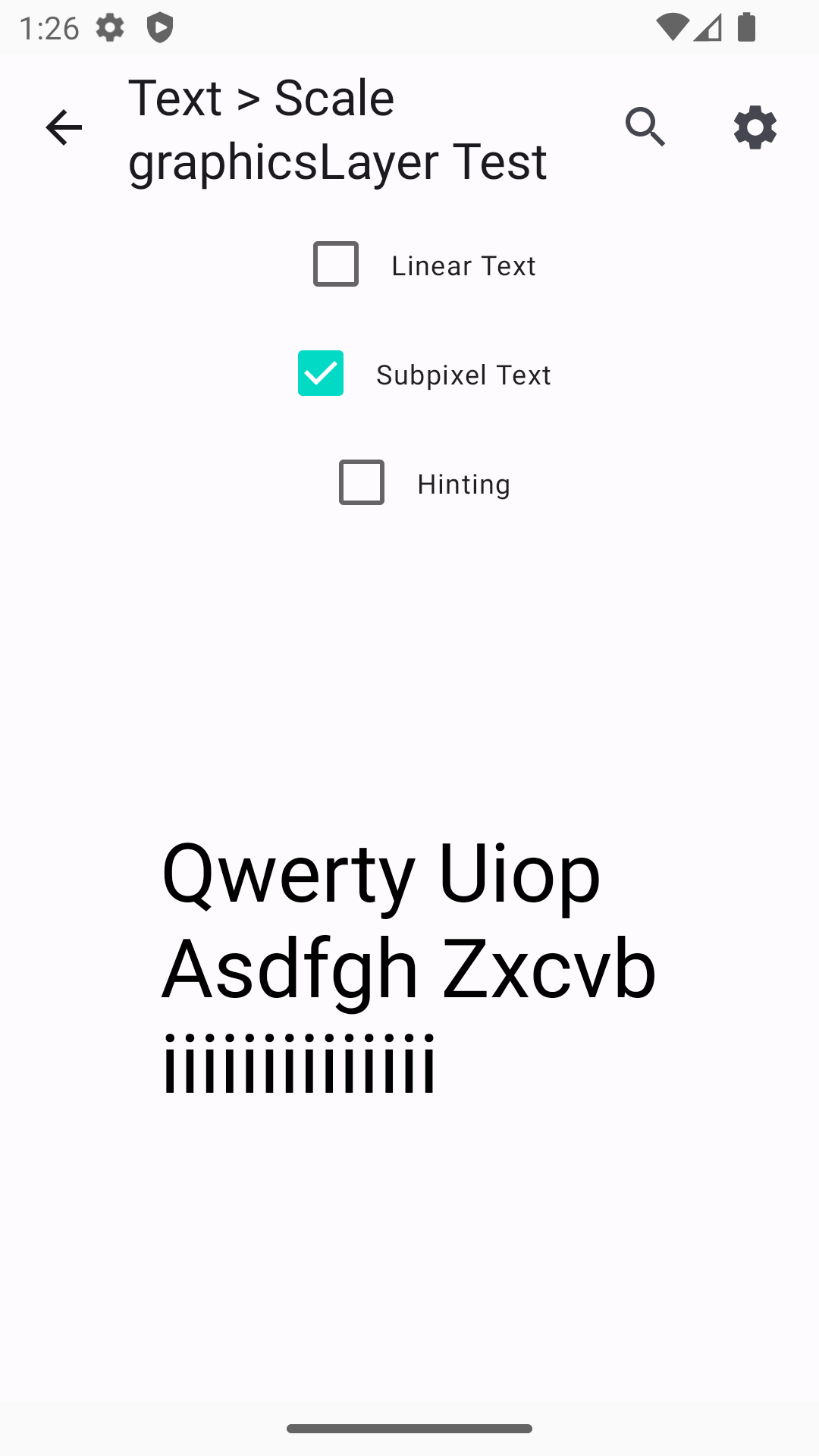
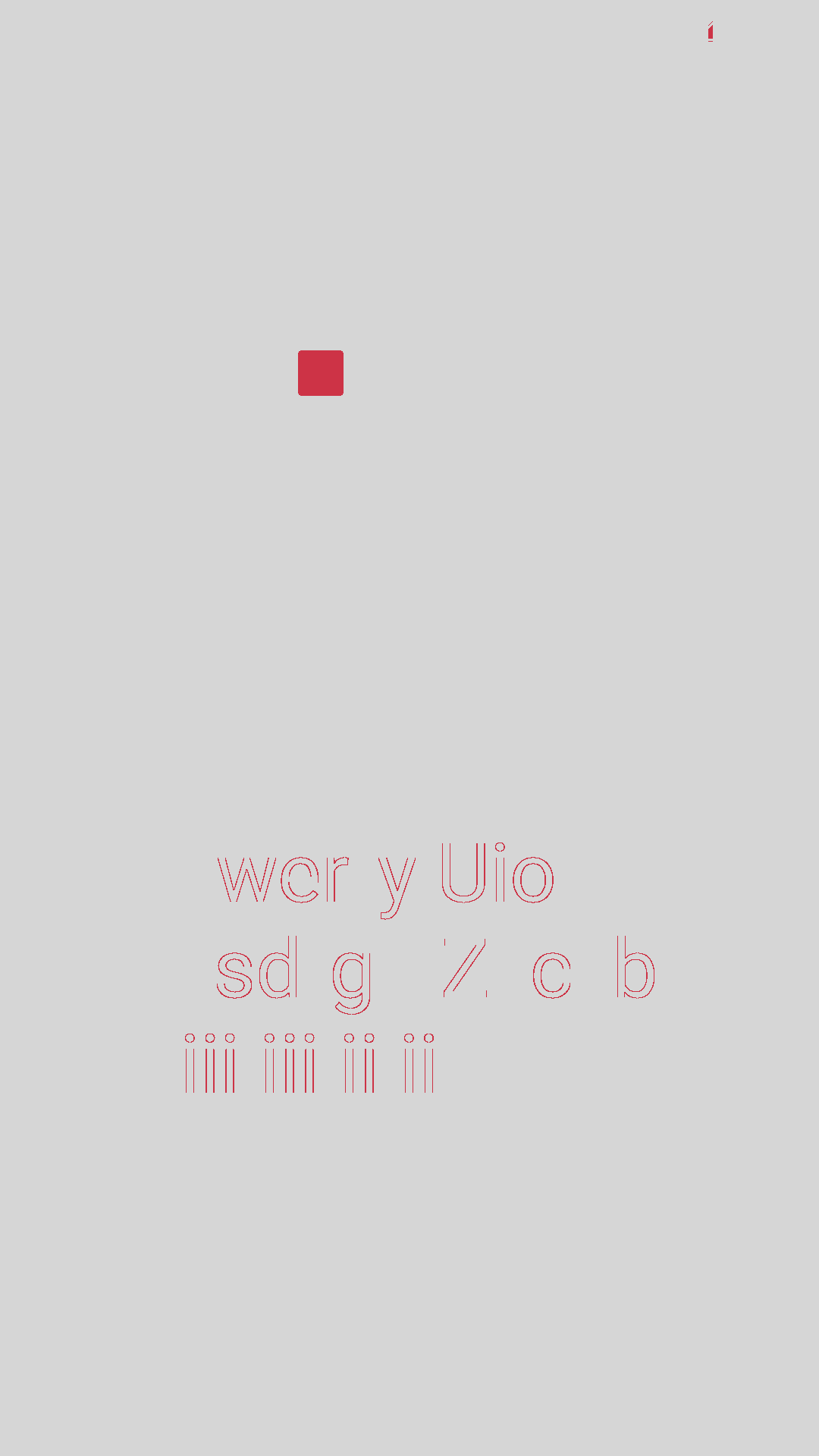
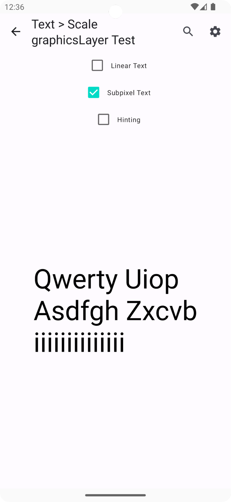
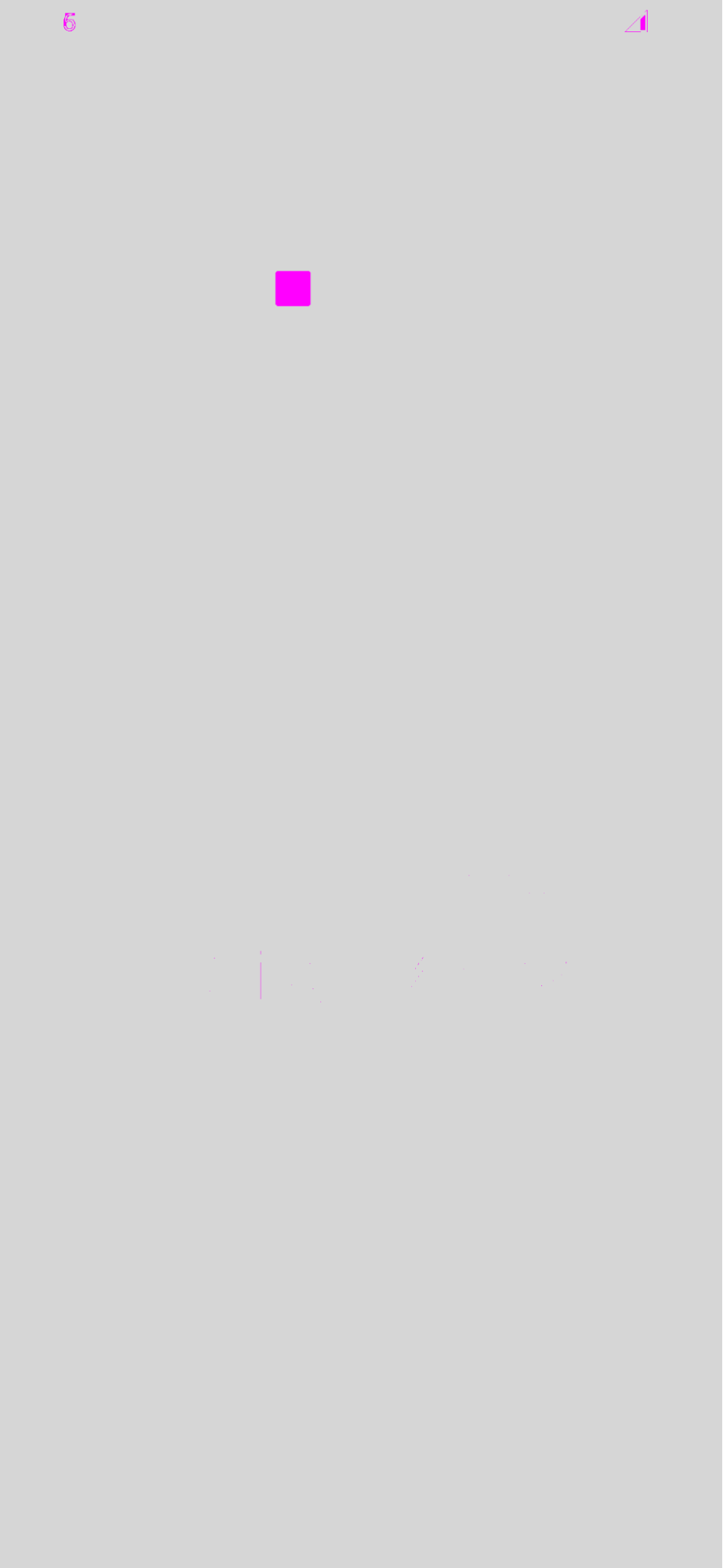
Not surprisingly, subpixel positioning’s effect diminishes as screen DPI increases. The reason is quite clear. Instead of helping antialiasing to work out the grayscale intensity on border pixels of glyphs by supplying fractional values, high DPI screens simply provide much more pixels for an area to eliminate the need for fractional values. 0.25 pixels basically becomes a whole pixel in high DPI. The table below shows the text rendering difference between various DPI configs;
| API 33 | Subpixel Off | Subpixel On | Diff |
|---|---|---|---|
| XHdpi Wear OS (2.0, 320) | 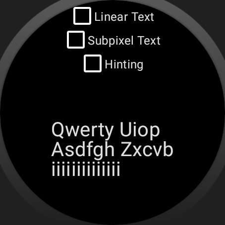 |
 |
 |
| Low DPI (0.75, 120) | 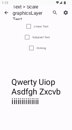 |
 |
 |
| XXHigh DPI (3.0, 480) | 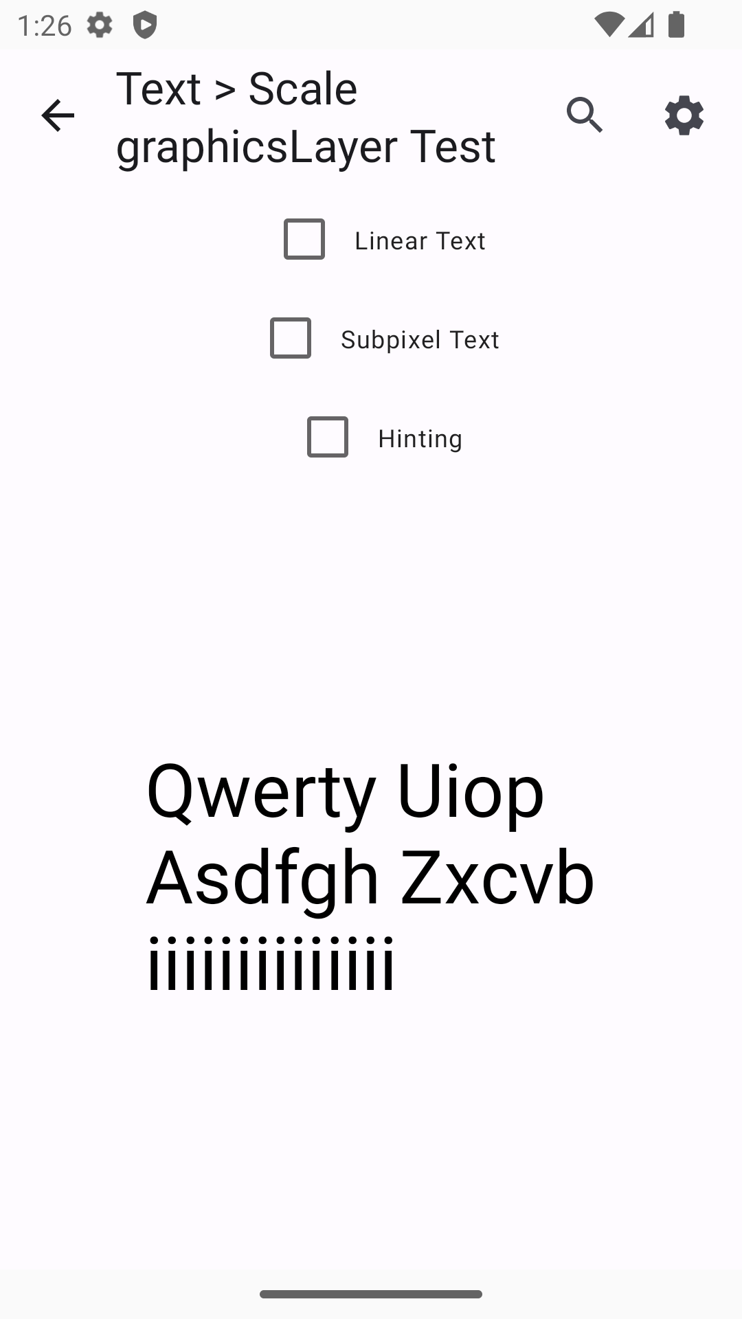 |
 |
 |
| Ultra High DPI (3.5, 560) | 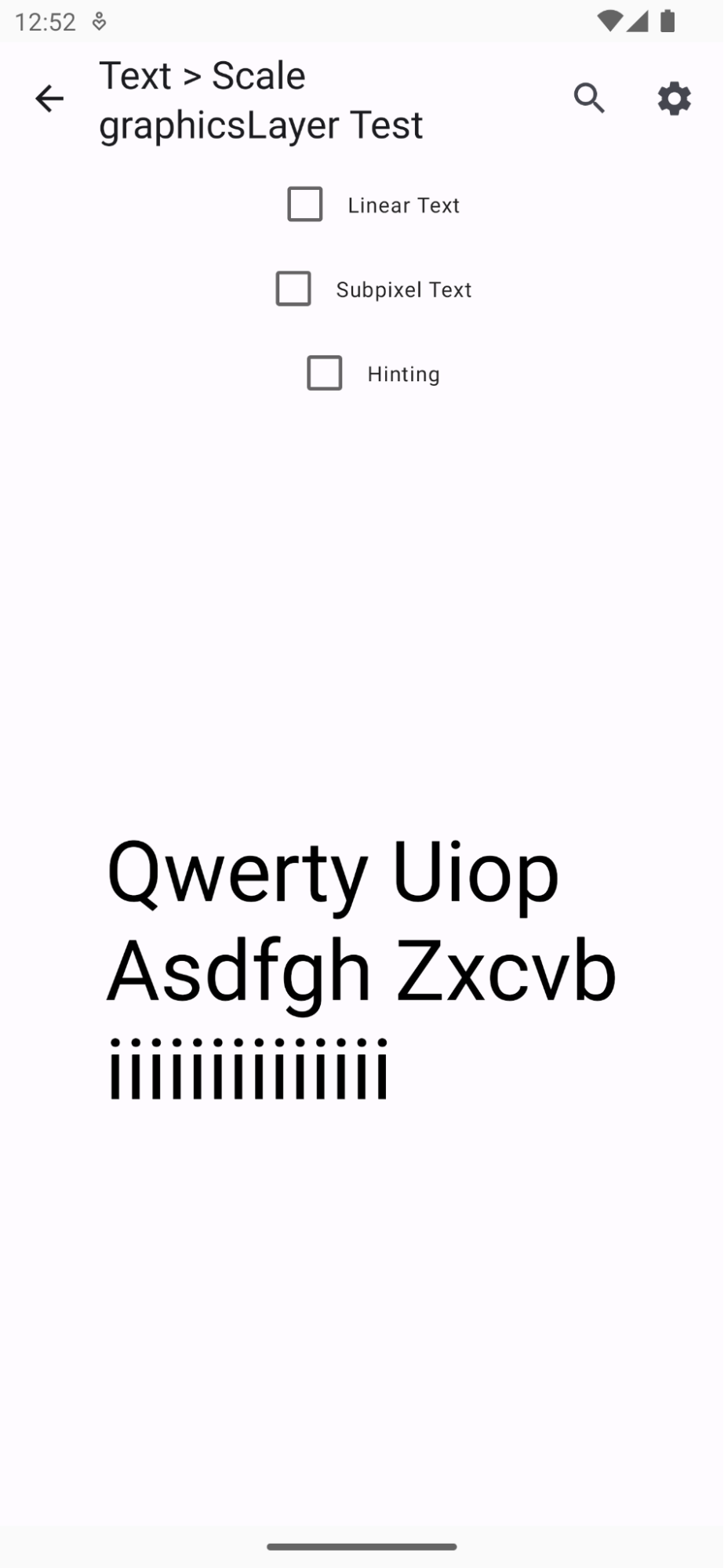 |
 |
 |
Levers
We have talked about 3 levers that configure how glyphs are placed and rendered on individual pixels. Some make text more legible and readable, some help animations. Using these levers for the correct use case becomes very important. Hinting can be turned on by default but subpixel text positioning is not suitable for static text that should be the same on every screen it’s rendered.
| API 33 Low DPI | graphicsLayer scaling | fontSize scaling | Comments |
|---|---|---|---|
| Nothing | 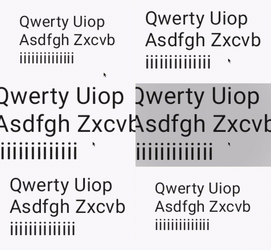 |
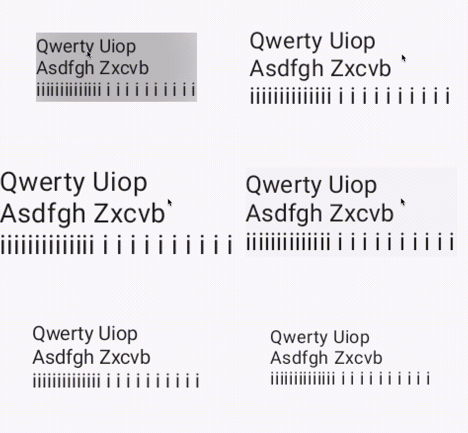 |
No hinting, no flags. As expected both animations suffer. `GraphicsLayer` based scaling has jittery font issue, font size does not scale well without linearity. |
Hinting (Default behavior) setHinting(true) |
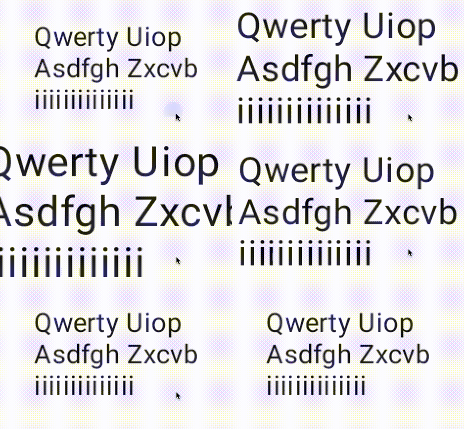 |
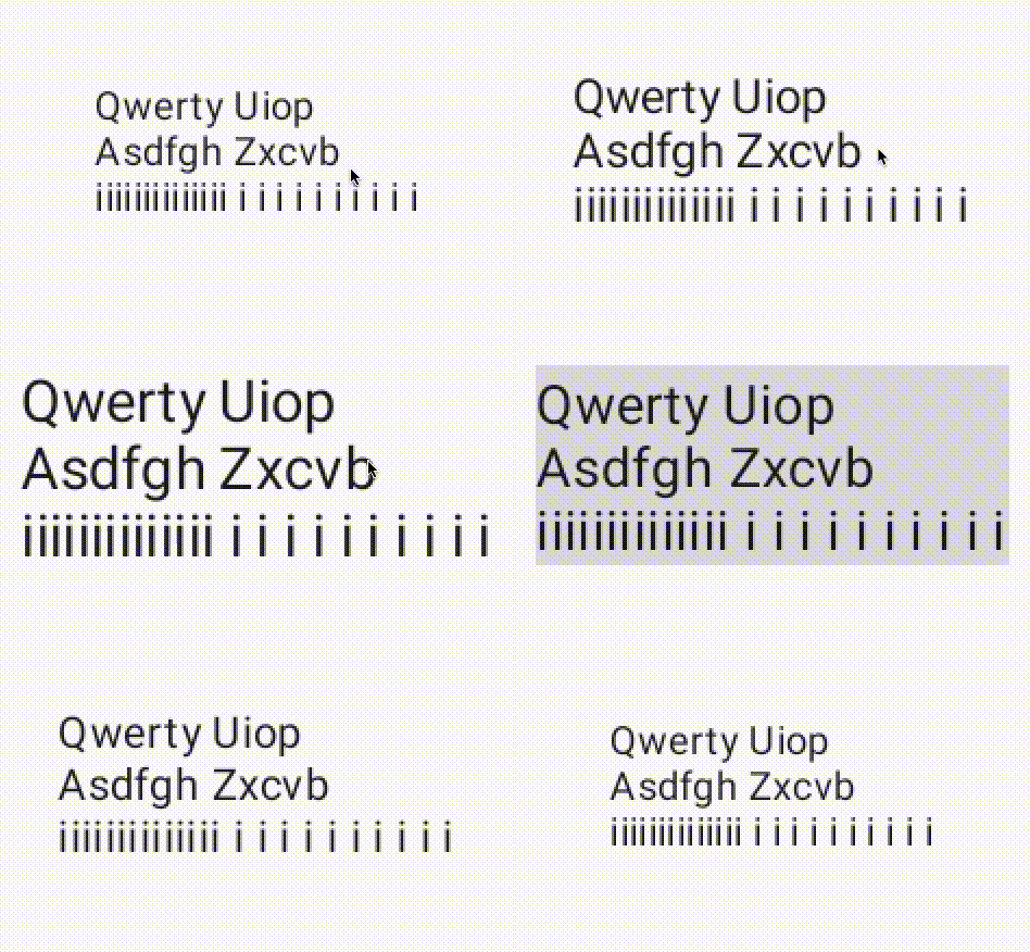 |
`GraphicsLayer` does not change much compared to the “Nothing” option. Font size scaling gets much worse. Hinting is clearly non-linear. |
Linear LINEAR_TEXT_FLAG |
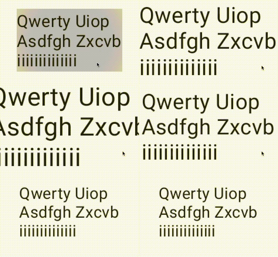 |
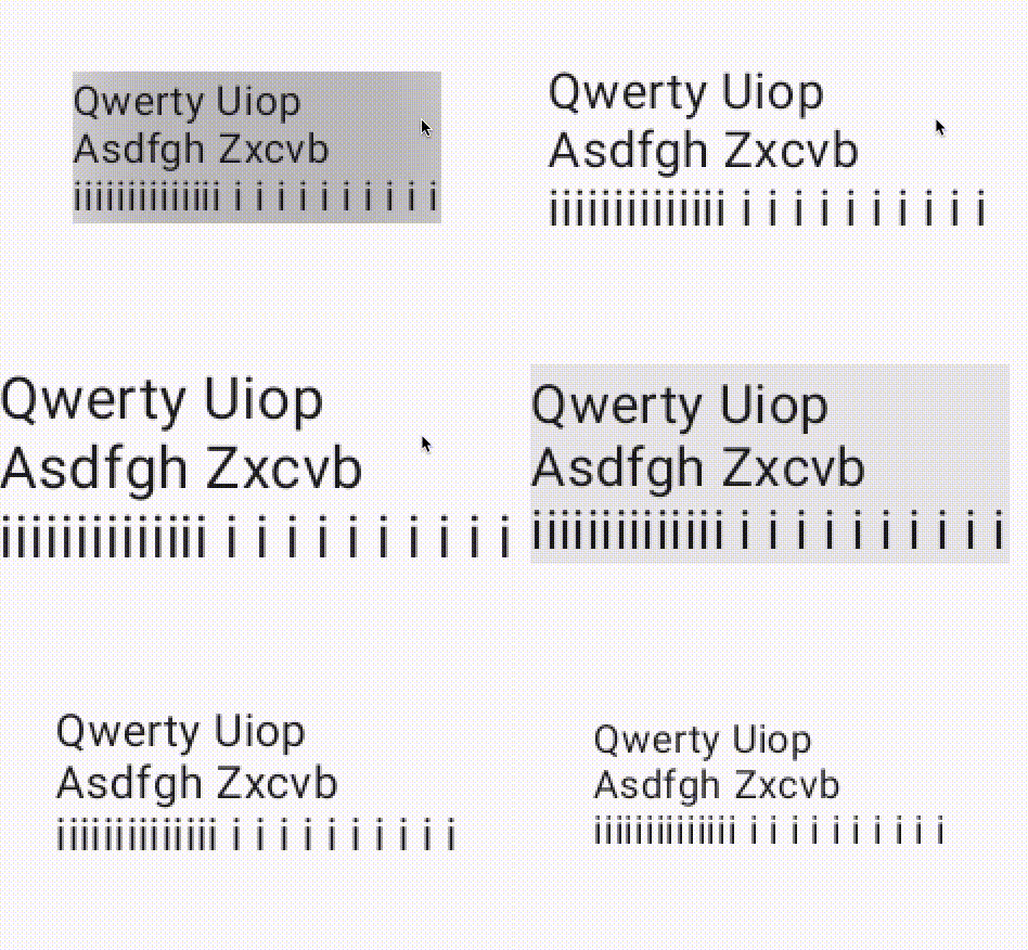 |
GraphicsLayer scaling does not benefit from LINEAR_TEXT_FLAG. Jittering still continues. Font size animation finally gets continuous increase and decrease thanks to linearity. However, jittering cannot be eliminated. |
Subpixel SUBPIXEL_TEXT_FLAG |
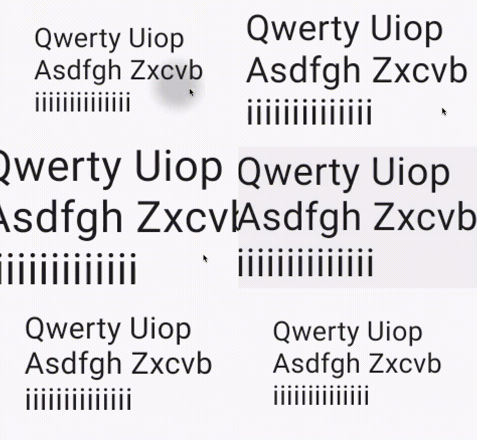 |
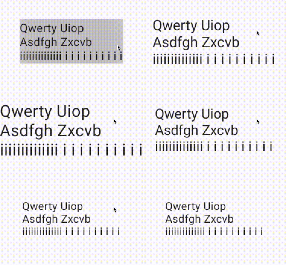 |
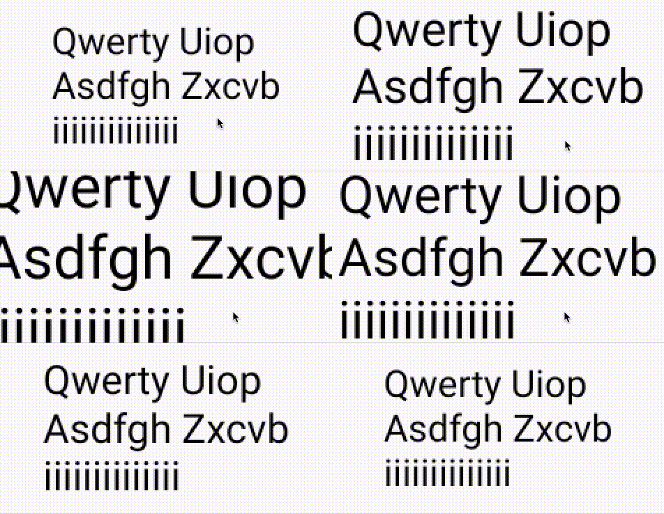
GraphicsLayer animation looks much better now. Only jittering happens in vertical axis since we do not have access to disabling baseline snapping. Font size animation returns back to the normal non-linear behavior |
L&S LINEAR_TEXT_FLAG and SUBPIXEL_TEXT_FLAG |
 |
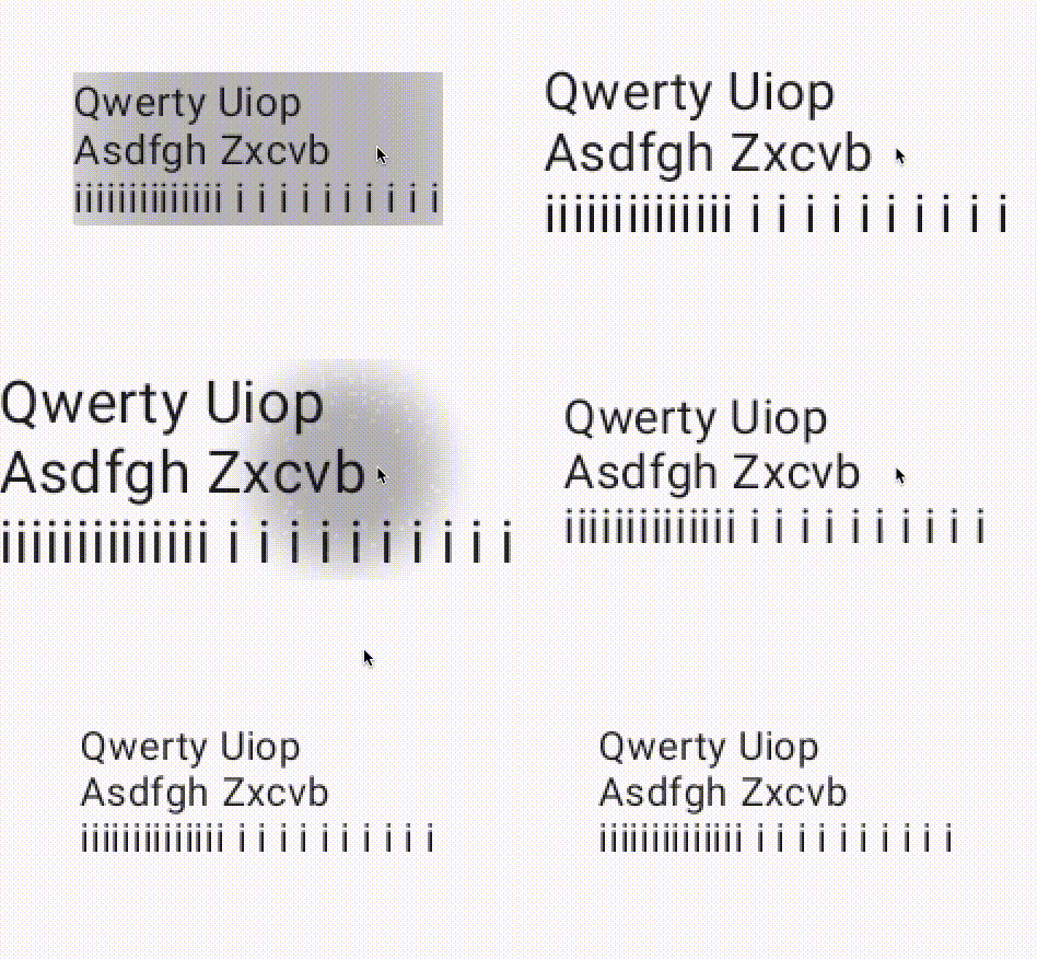 |
Documentation recommends applying both these flags together. Interestingly it doesn’t add much to visual quality compared to only applying SUBPIXEL_TEXT_FLAG. Animations remain jittery in the vertical axis. |
Alpha Hack / CompositingStrategy
This hack is no longer a hack thanks to this CL aosp/2277787
Instead of applying alpha = 0.99f, we can switch to using new graphicsLayer compositingStrategy API
modifier = Modifier
    .graphicsLayer {
        scaleX = scale
            scaleY = scale
        // alpha = 0.99f // Not necessary anymore
        compositingStrategy = CompositingStrategy.Offscreen
    }
An offscreen compositing layer has been used to apply alpha to Views/RenderNodes since Marshmallow(API 23). Compose also adopts this technique of applying alpha at GraphicsLayerScope. Using a compositing layer involves carrying all the information from the screen onto an offscreen layer, doing any operation like blending, and then carrying the result back to the screen as explained here.
How does this affect text rendering? If text is rendered on screen, then carried to a compositing layer to do scaling, text will be scaled just like an image.
How can we achieve this in Compose? By simply using an alpha value that’s not 1f e.g. 0.999f in a graphicsLayer modifier. Once an alpha is set on a RenderNode, it automatically switches to an offscreen layer.
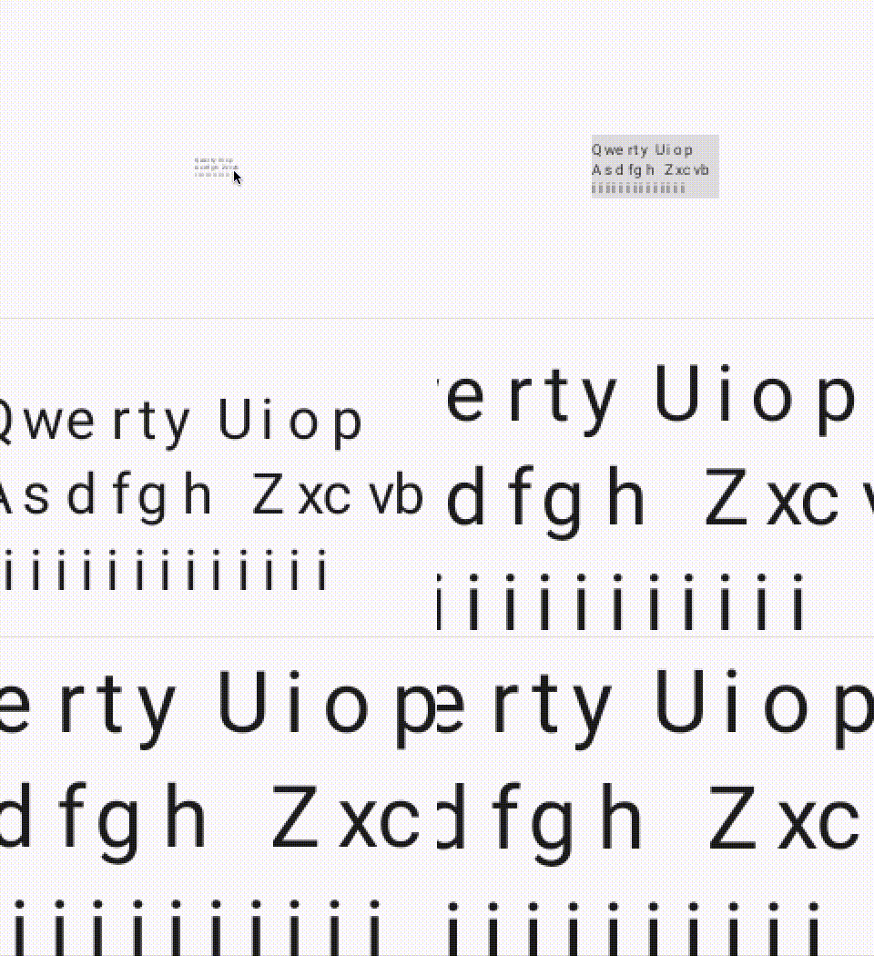
What about loss of detail? That pretty much is a guarantee when we use alpha to scale Text. Let’s take a look at the animations below.
In short, this hack rasterizes text at the original scale and performs scale operation on a bitmap.
Interception; Ok, it is not actually a bitmap but you get the idea. I use the word bitmap to basically mean a rasterization.
PS; I found this post recommending rasterization for text scale animation on web. It also gives a very good explanation of why text animation is an incredibly complex use case.
| GraphicsLayer scaled Text without alpha | GraphicsLayer scaled Text with alpha |
 |
 |
When scaling is exaggerated as in above case, offscreen layer starts showing its ugly face for text. On the other hand, if scaling is done in [0.8f,1.2f] range (values chosen arbitrarily through manual experiments), alpha hack doesn’t seem to make the text look worse or better. You can check Solutions/Option 1 for a demonstration.
Furthermore, scaling this way is much much smoother compared to any other flags that we have discussed in this document. Disadvantage of course being loss of detail when scale is exaggerated.
API 28 and changing Text Rendering
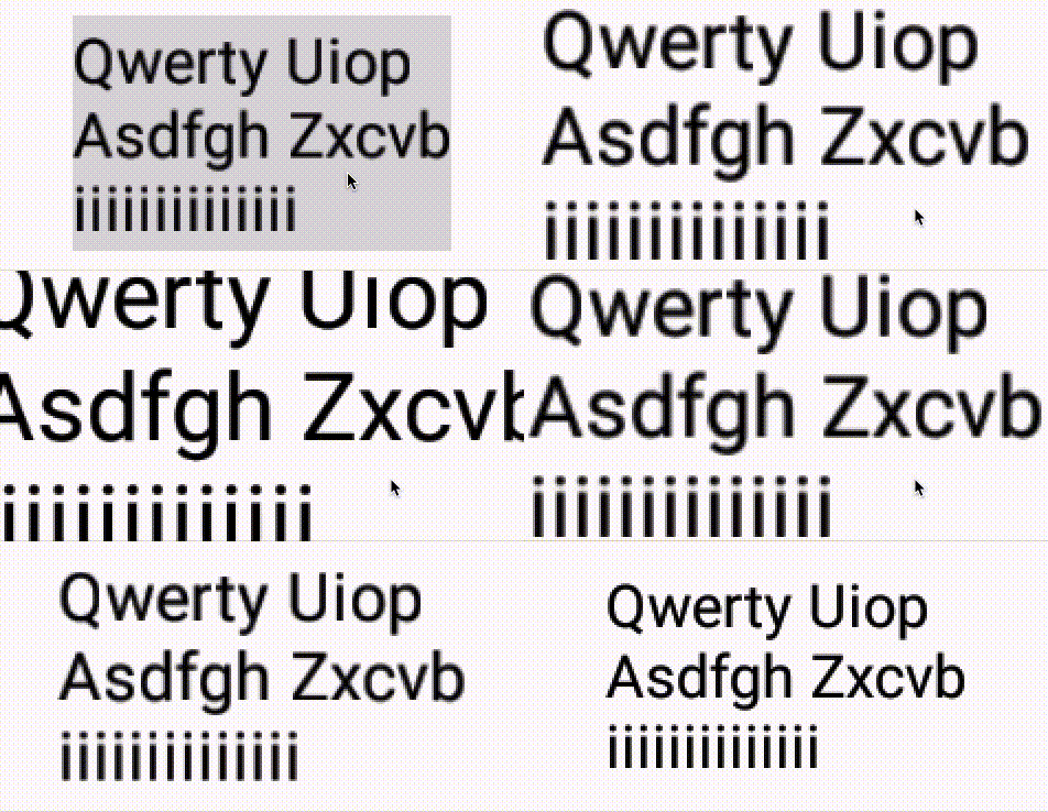
Reasons explained at [0], something caused a major change to text rendering in API 28. Most probably it was part of hwui->skia migration that happened over several years encompassing API 28. Below gifs show how graphicsLayer scaling behaves on API 27-28 respectively. Lower level APIs until 21 (minimum supported by Compose) mimics API 27 behavior while higher APIs follow API 28.
| API 27 graphicsLayer scaling | API 28 graphicsLayer scaling |
 |
 |
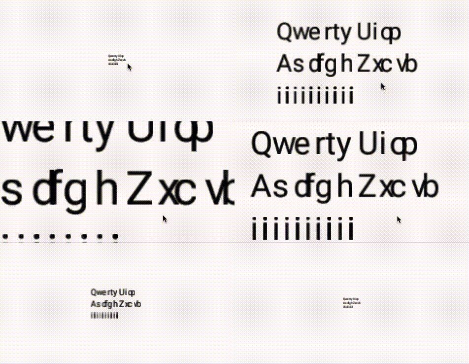
Maybe it follows the same principles that made alpha hack work, an offscreen layer. Let’s test if smooth scaling causes any side effects for large changes e.g. scaleX = 16f, scaleY = 16f on API 27.
| Hinting On | Linear and Subpixel On | |
| API 27 | 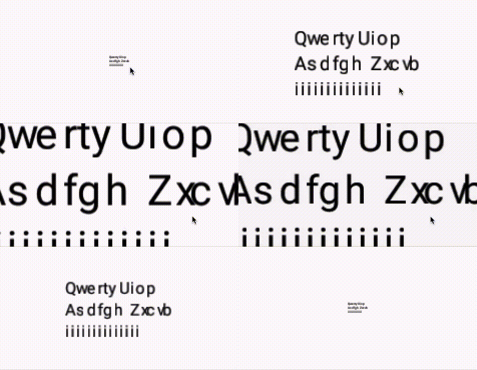 |
 |
| API 28 | 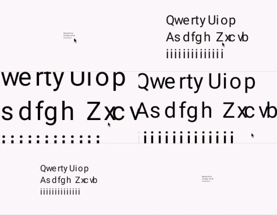 |
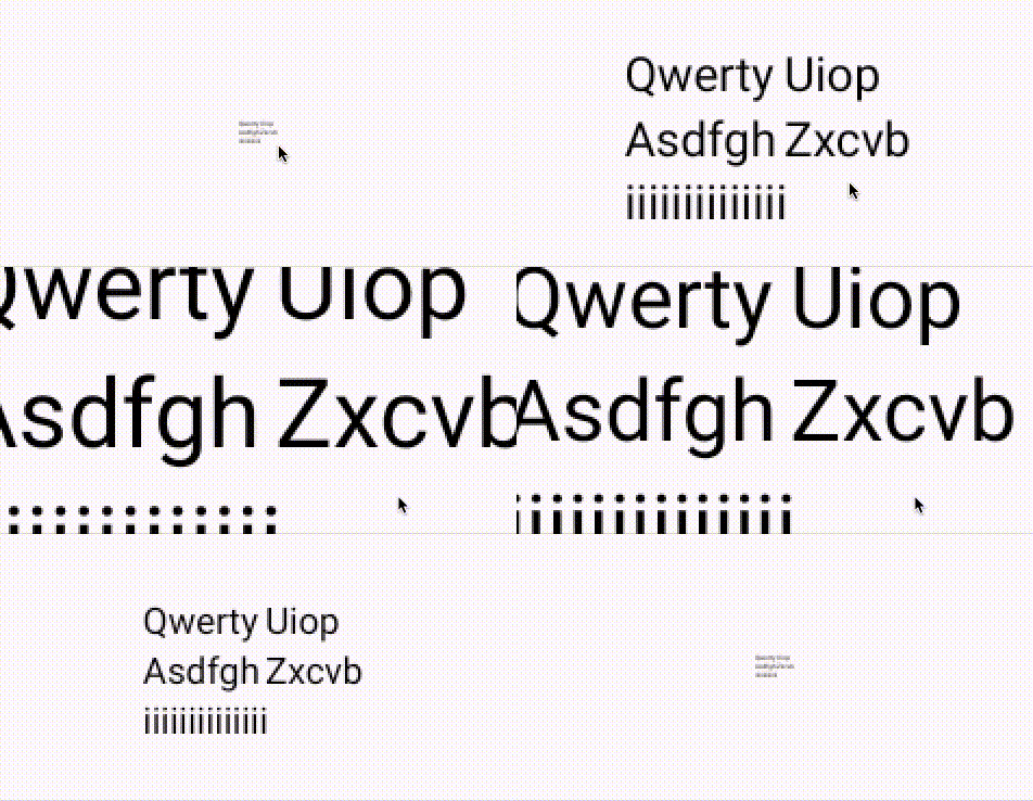 |
There is no major blur happening in any of these examples, indicating that probably no rasterization is occurring at low scale.
Now we can also clearly see how LINEAR_TEXT_FLAG was out-of-use until API 28. There is almost no benefit of using LINEAR_TEXT_FLAG in API 27 compared to the default hinted layout. However, API 28 shows a major improvement for scale animations when LINEAR_TEXT_FLAG is applied.
Solutions
I’m cutting out this part largely because it gets kinda boring and basically boils down to two options that have been thoroughly discussed in this document;
Option 1: Use the new CompositingStrategy
CompositingStrategy.Offscreenis acceptable if the rendered text is only scaled between 0.8-1.2 range. Anything above or below makes the text look very blurry or simply unreadable. It solves the problem that WearOS is facing at the moment with the Picker composable.
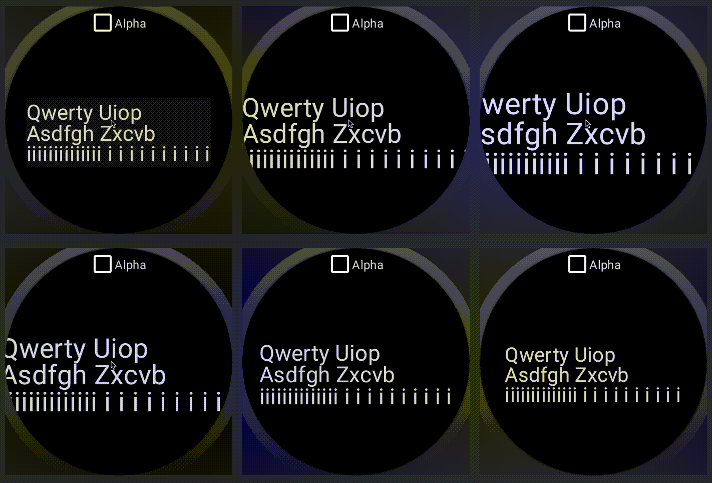 |
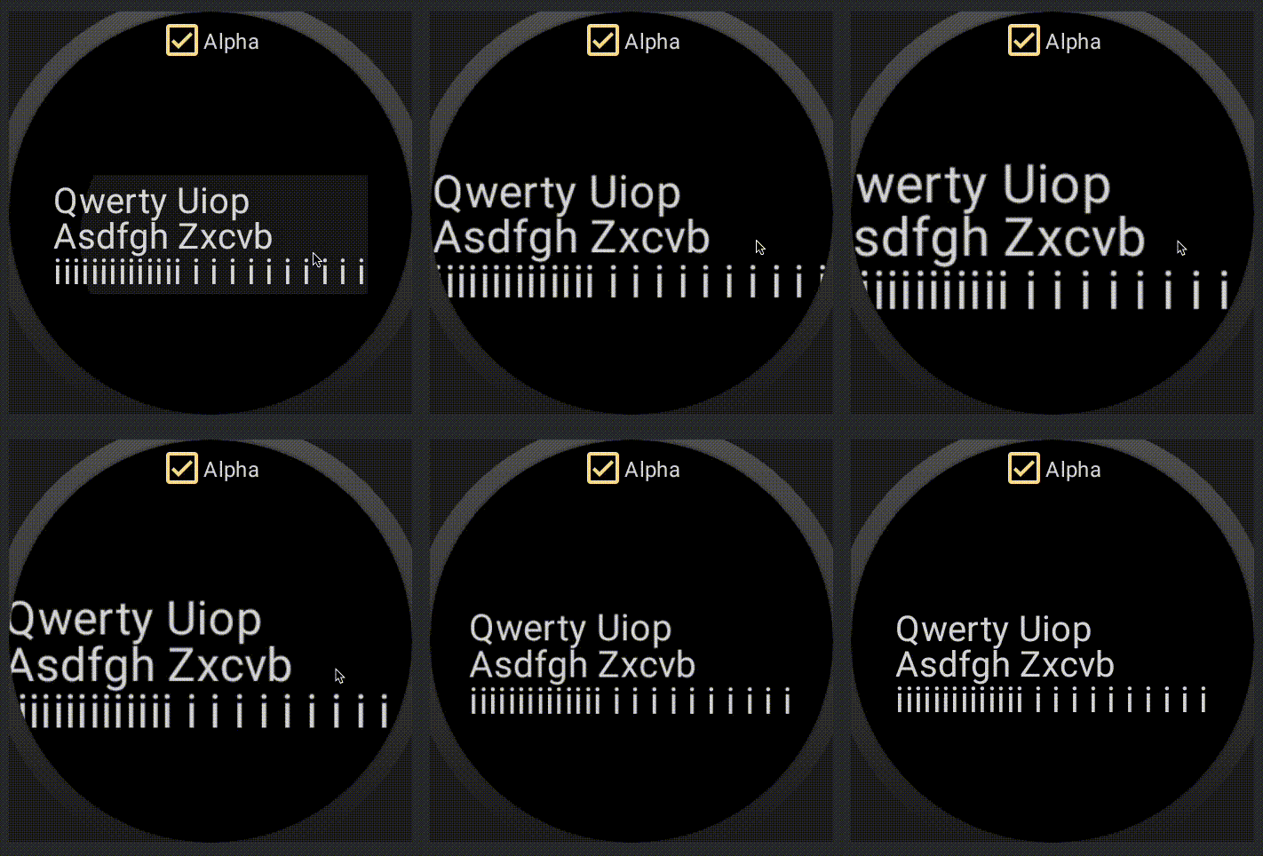 |
Option 2: Simplified TextMotion API
In this option we propose a very simplified API on Compose side that is called TextMotion. We think that there aren’t many configuration options that make sense as TextPaint flags. The ones we have uncovered are either for Static or Animated text.
TextMotion.Staticenables hinting, disables linearity and subpixel positioning.TextMotion.Animatedis the exact opposite.
Good thing about this solution is that it doesn’t need to rasterize the text onto an offscreen buffer. However, it also cannot get rid of vertical jitter. Not great for multi-line text animations…
Conclusion
We ended up shipping both solutions. To be fair, CompositingStrategy had many more other reasons to exist besides solving this peculiar problem. On the other hand, TextMotion was a direct solution to the jittery text animation.
I published this document in the hopes that somebody finds Text layout and rendering interesting and would like to dive into its history on Android. There isn’t much fascinating knowledge being shared here.
My main purpose was to inspire and let the reader realize and appreciate the work that goes into Text.
Appendix
[0] John Reck;
Old HWUI pre-skia would only re-sharpen glyphs in binned buckets. So it was like a hybrid of the offscreen layer & the 28+ behavior. For small changes (<15% iirc), it would prefer to use an existing rasterized glyph from the cache (so similar to the layer scaling quality, but without actually paying the cost of an offscreen buffer). If the font scaled beyond that, then it’d re-rasterize the glyph to sharpen it up.
This was done for performance reasons, but this doc seems like maybe it’s worth doing for quality reasons, too.